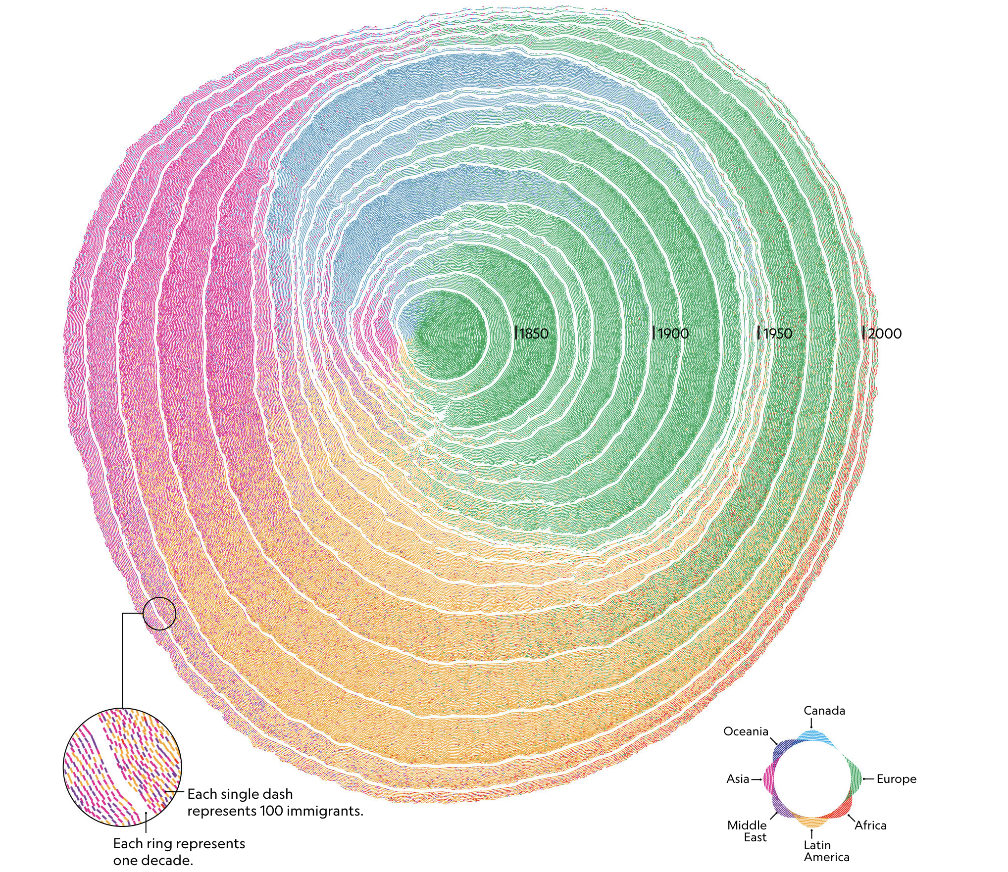
US Immigration as Tree Rings
This is an excellent graphic from the National Geographic which shows US immigration as a build up of tree rings around a central point. It shows both the flow over time and the count of people in a clear manner that makes it easy to compare over time. Work like this helps people get intutive senses around large bodies of data and I fully support bring more clarity to this.

